Project overview
Reimagine the digital approach of Armstrong's website by offering a mix of editorial content featuring beautiful architectural photography, case studies, and an e-commerce solution. The scope of the project was to establish a base of design patterns for hand-off to the internal Armstrong design team to build their new design system.
Style Tiles
Style tiles were created to explore colors and typography for the new site. After style tiles were established, the process of applying these elements to a design of the home page and one internal page were continued.
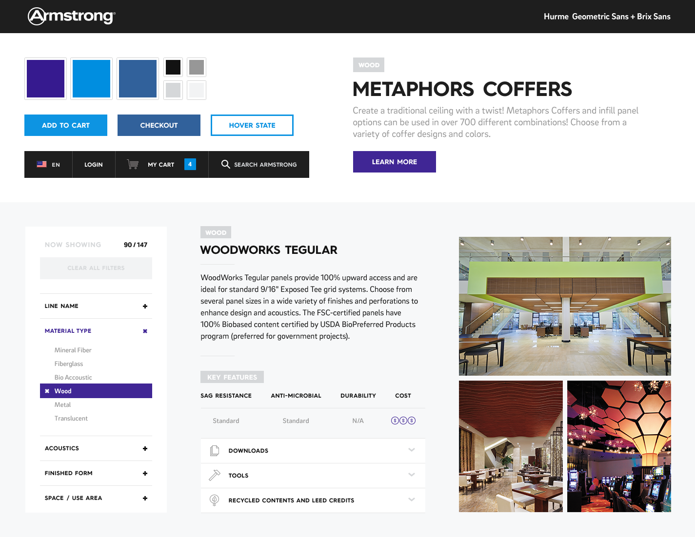
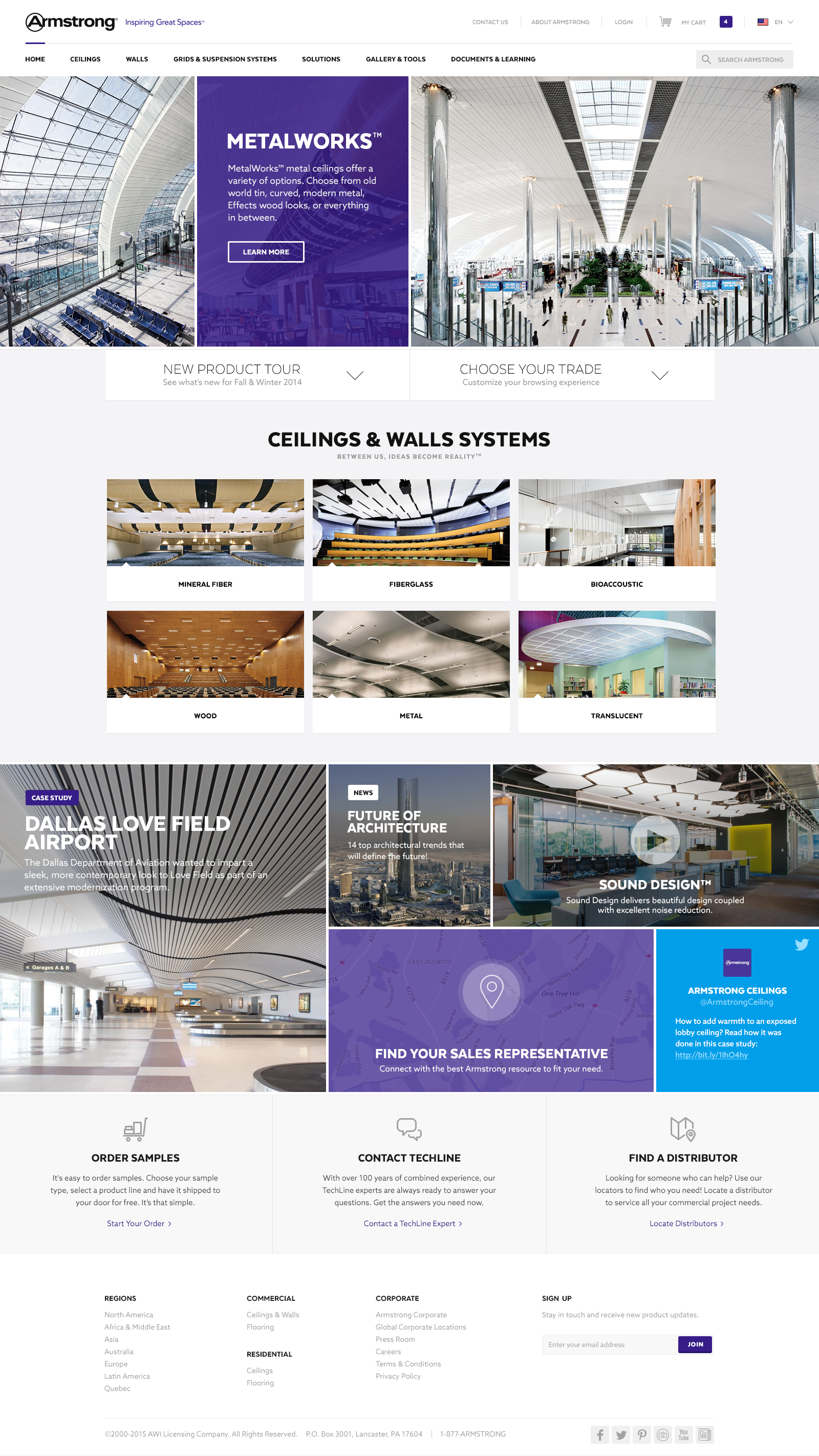
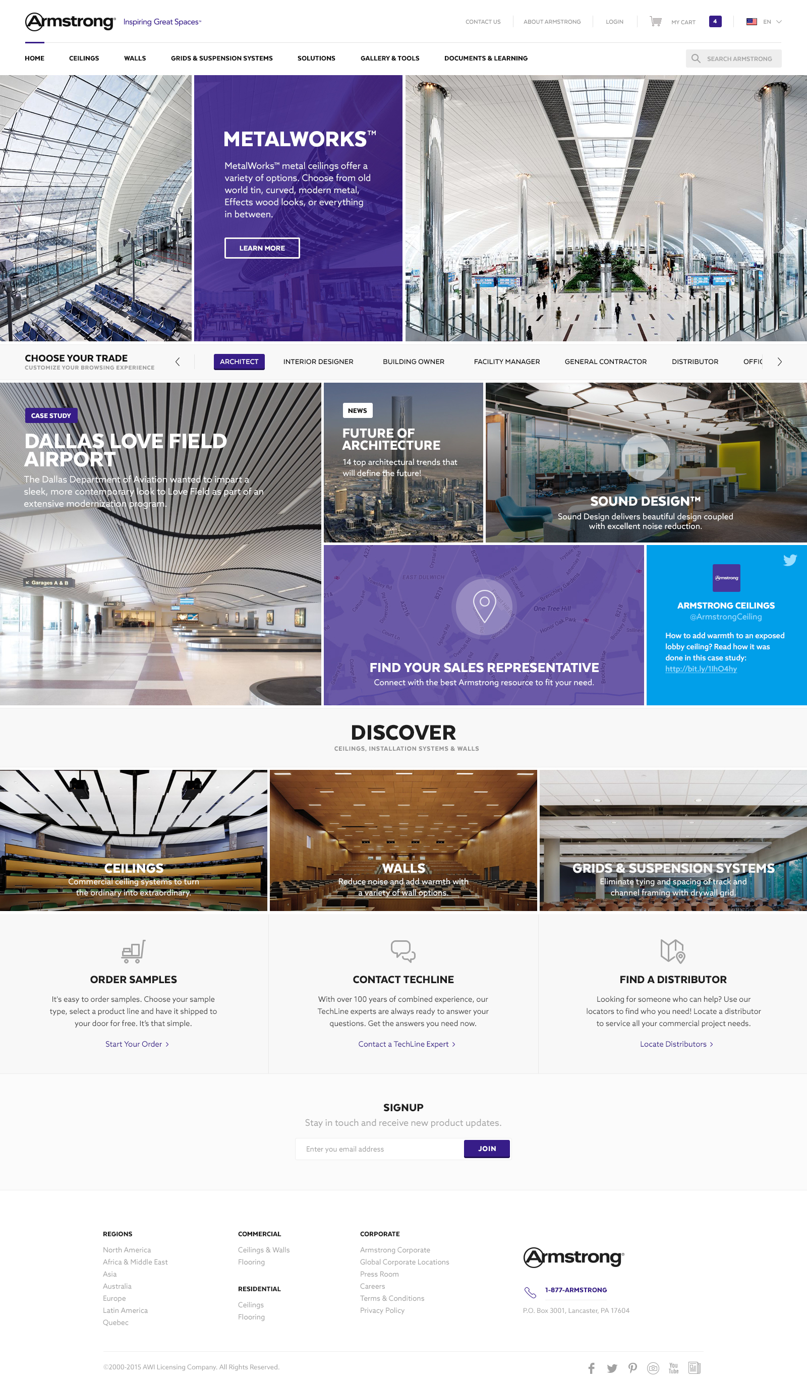
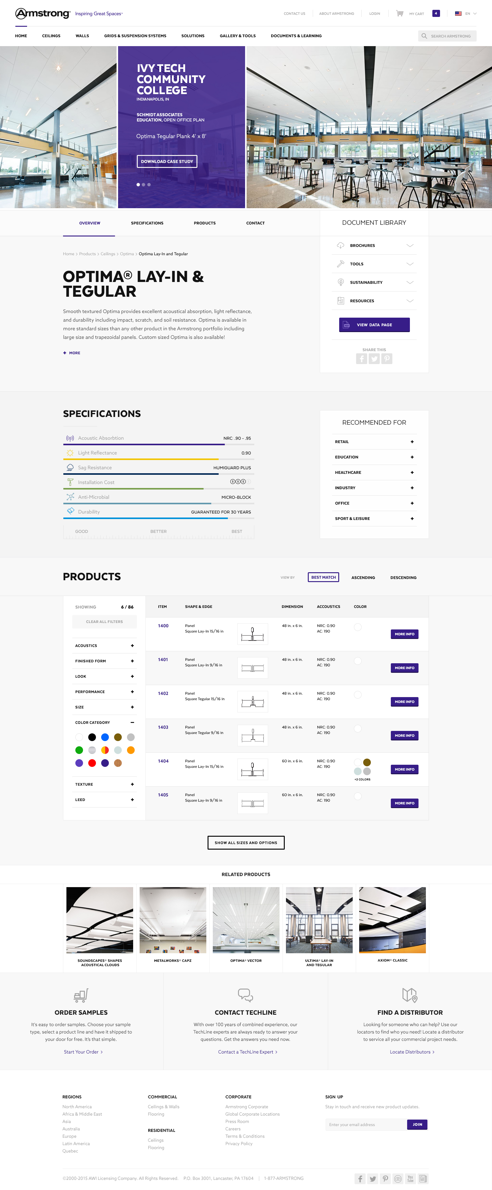
Design Explorations / Option A
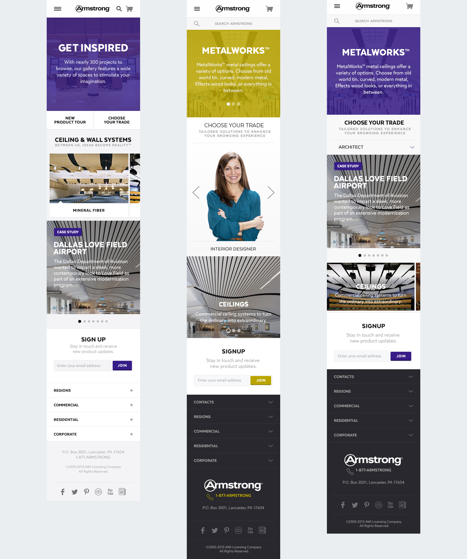
This option explored purple as the primary color, bold font for the headline text, and san serif for the paragraph text. The primary content emphasis of this experience drives users to editorial and case study content, then secondarily product categories. In addition, tables were explored for product catalog information on the product description page.
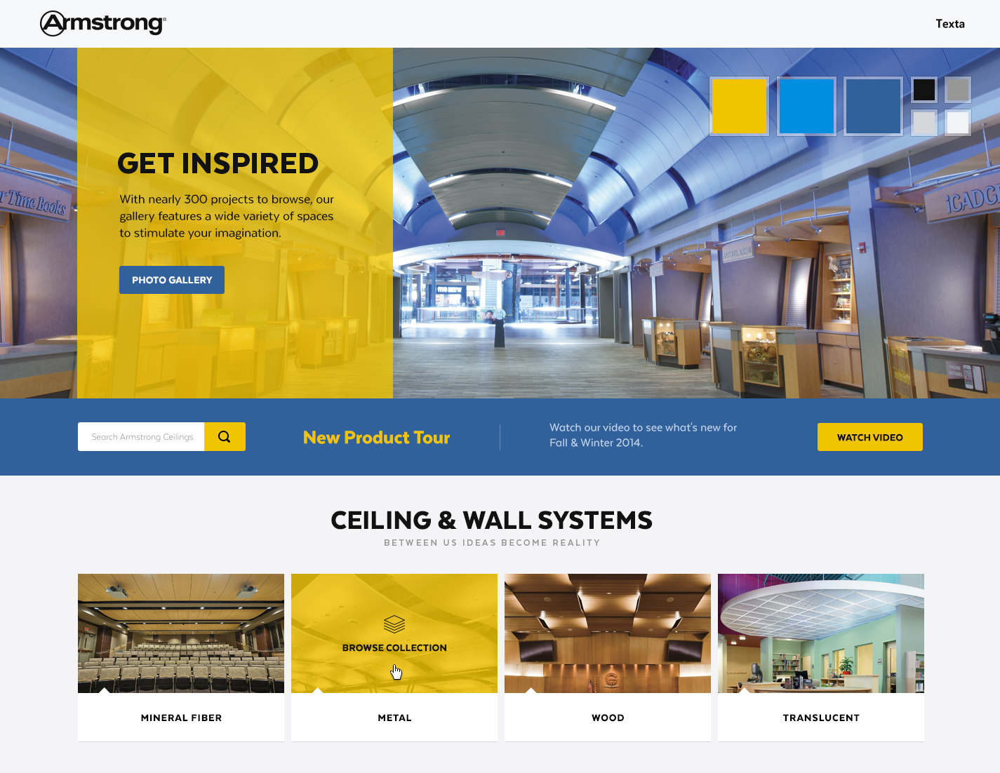
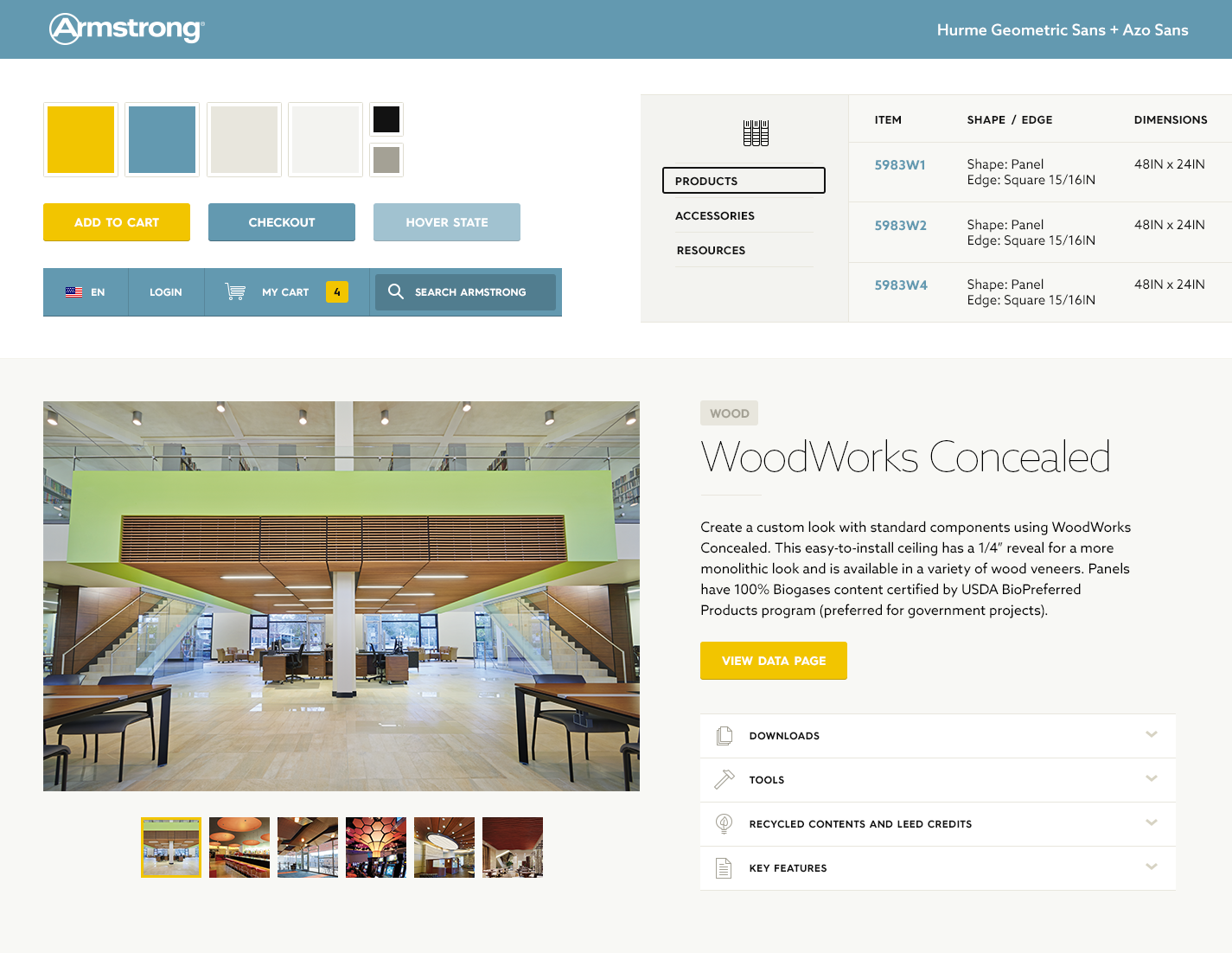
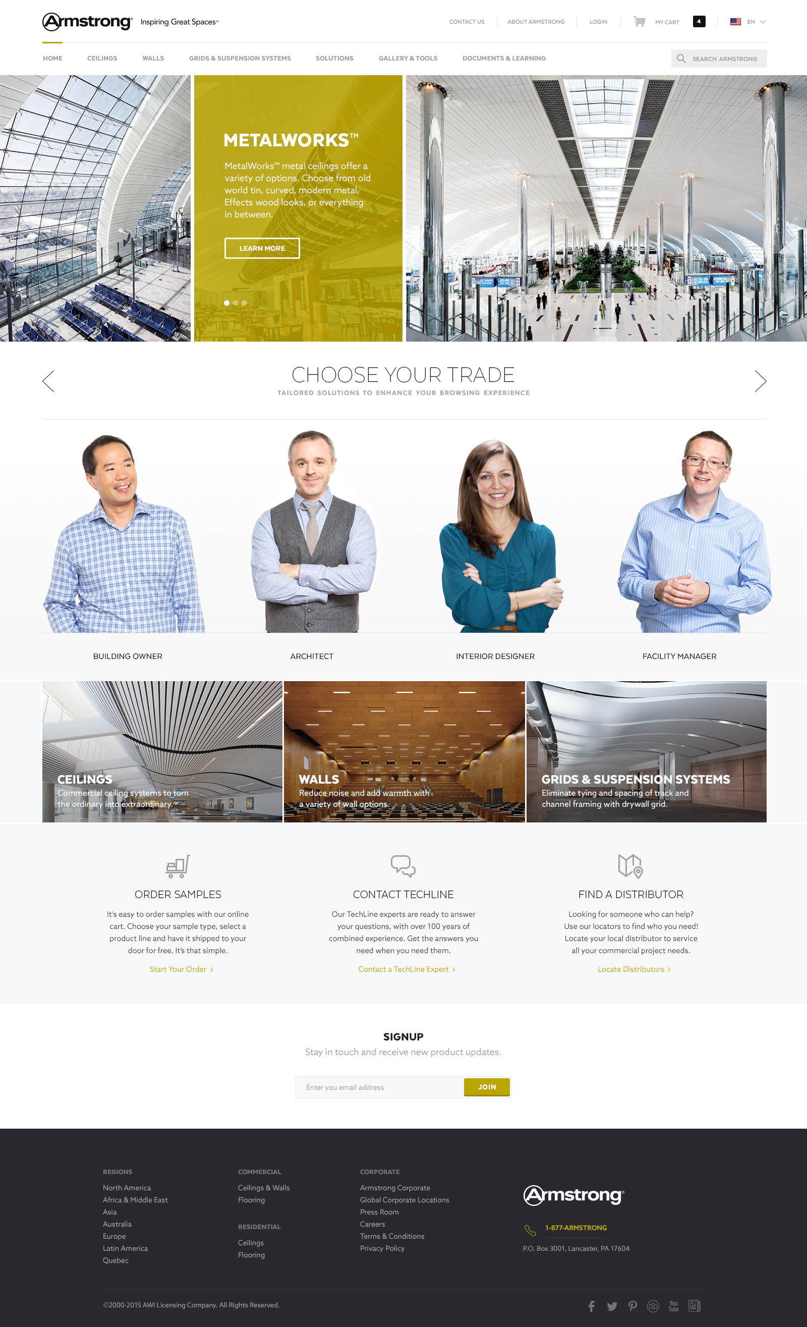
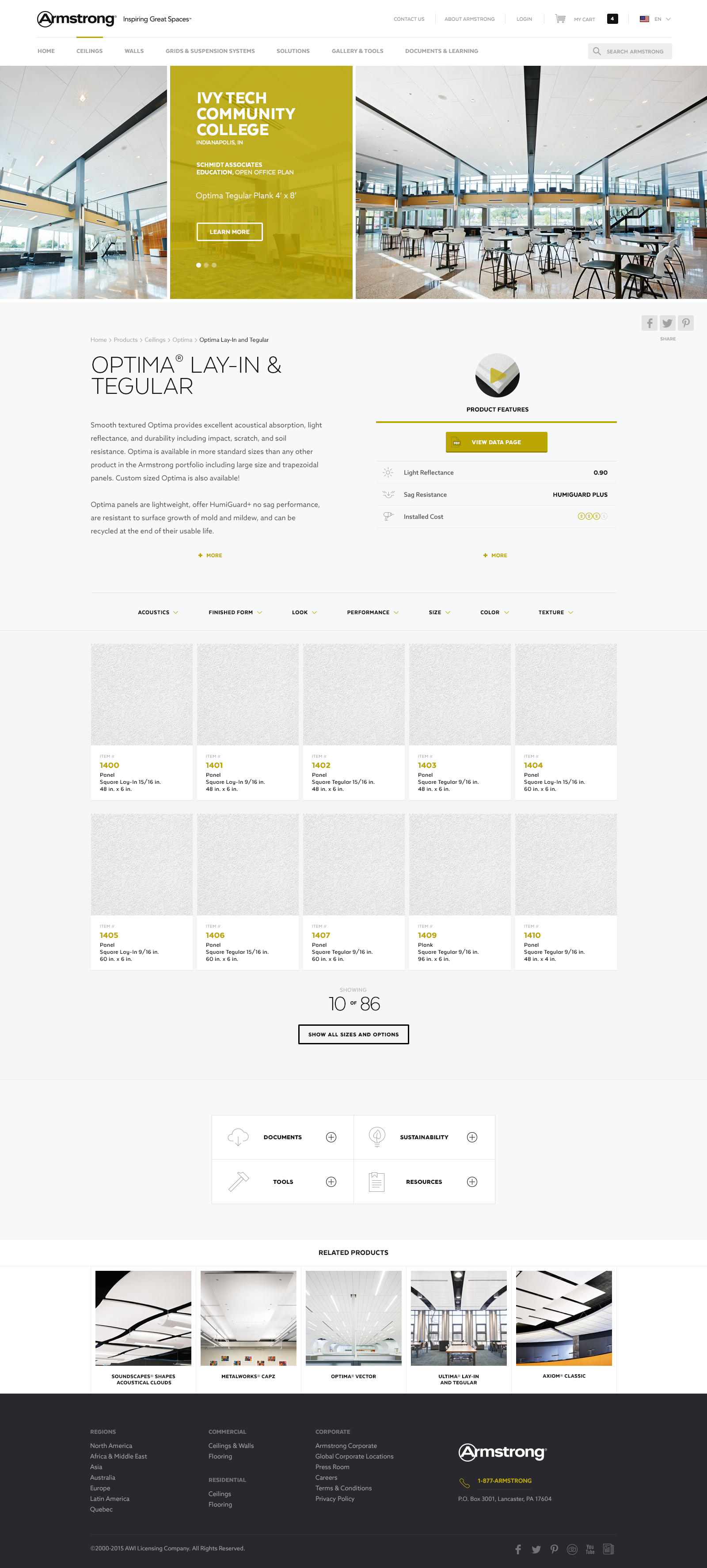
Design Explorations / Option B
This option explored yellow as the primary color, thin font for the headline text, and san serif for the paragraph text. The primary content emphasis of this experience drives users to trade specific content, then secondarily product categories. In addition, tiles were explored for product catalog information on the product description page.
Mobile
Project carried out as part of my role as s Senior Designer & Art Director with the Microsoft Store Studio team.
Engagement background
Project carried out for my role as a Senior Visual & UX Designer on the Armstrong project team at Siteworx, a experience consultancy agency.